You're a Legend! Problem
Given this data,
import numpy as np

rng = np.random.default_rng(1234)
x = np.linspace(start=0, stop=4*np.pi, num=100)
y_A = np.sin(x + 0.0 * np.pi) + rng.normal(scale=0.1, size=len(x))
y_B = np.sin(x + 0.5 * np.pi) + rng.normal(scale=0.1, size=len(x))
y_C = np.sin(x + 1.0 * np.pi) + rng.normal(scale=0.1, size=len(x))
y_D = np.sin(x + 1.5 * np.pi) + rng.normal(scale=0.1, size=len(x))

colors = {'A': '#9D44B5', 'B': '#B5446E', 'C': '#525252', 'D': '#BADEFC'}
make this scatter plot.
Show the plot
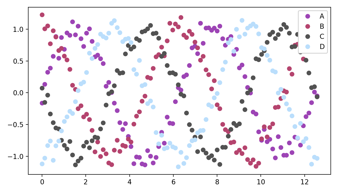
Notice the legend in the top right! Do this, and you're a legend, mate! 
The colors in this example were selected using colors.co - a free, online color palette generator.